Replaced a venture studio's slide deck with a fast, credible site they can grow themselves.
Design and build of naprico.com: Next.js, Tailwind, and Framer Motion, from Figma to deploy.
- Product Design & Frontend · 2025
- Web Design
- Development
- Branding
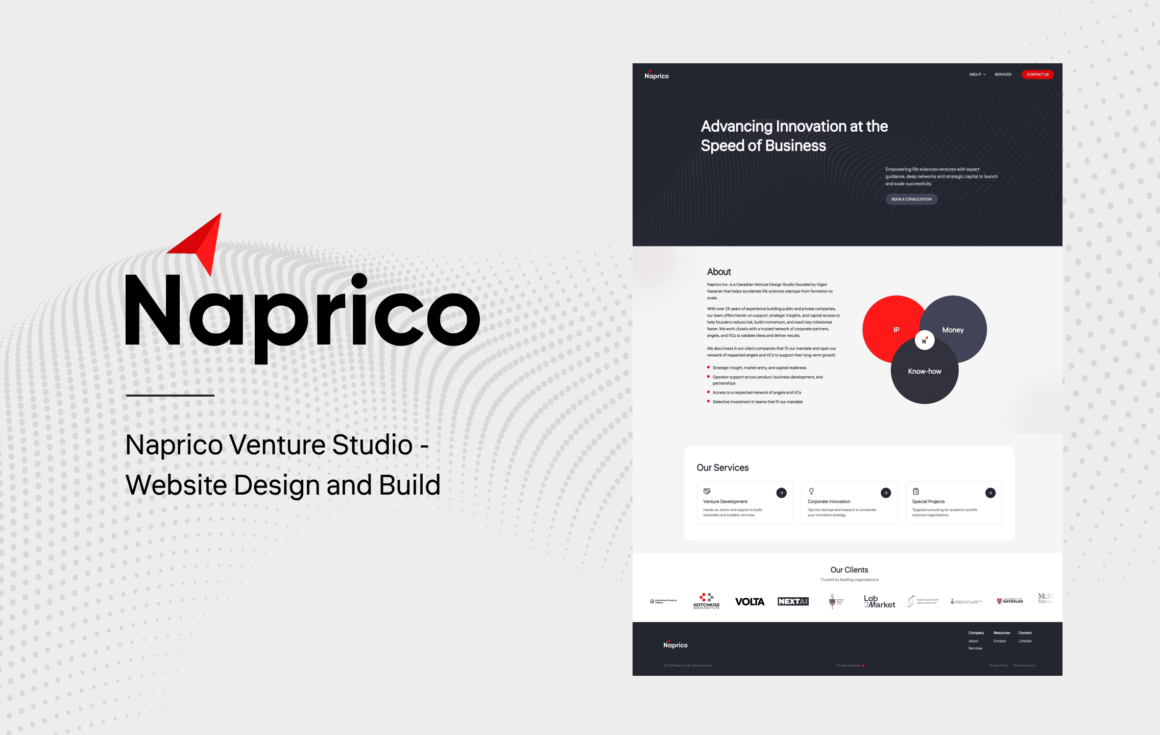
The brief
Naprico relied on a slide deck for one-on-one meetings. They wanted a site that could reach new clients, support outreach, and present a credible face to the market, with a stable base that could grow without a full rebuild. Success looked like a clear brand message on the first screen, services that are easy to skim, a founder section that adds trust, and a contact form that works every time.
From sketches to system
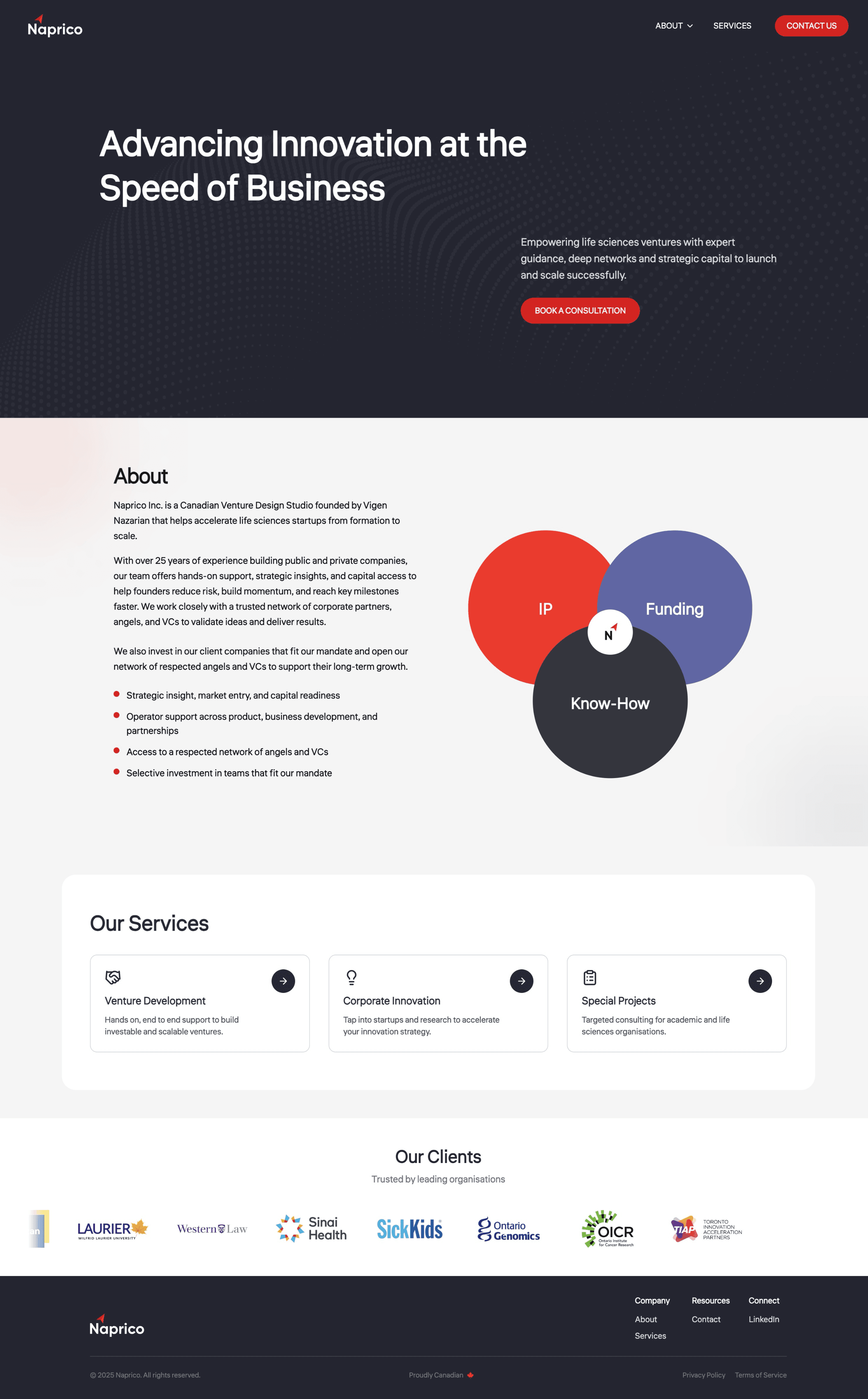
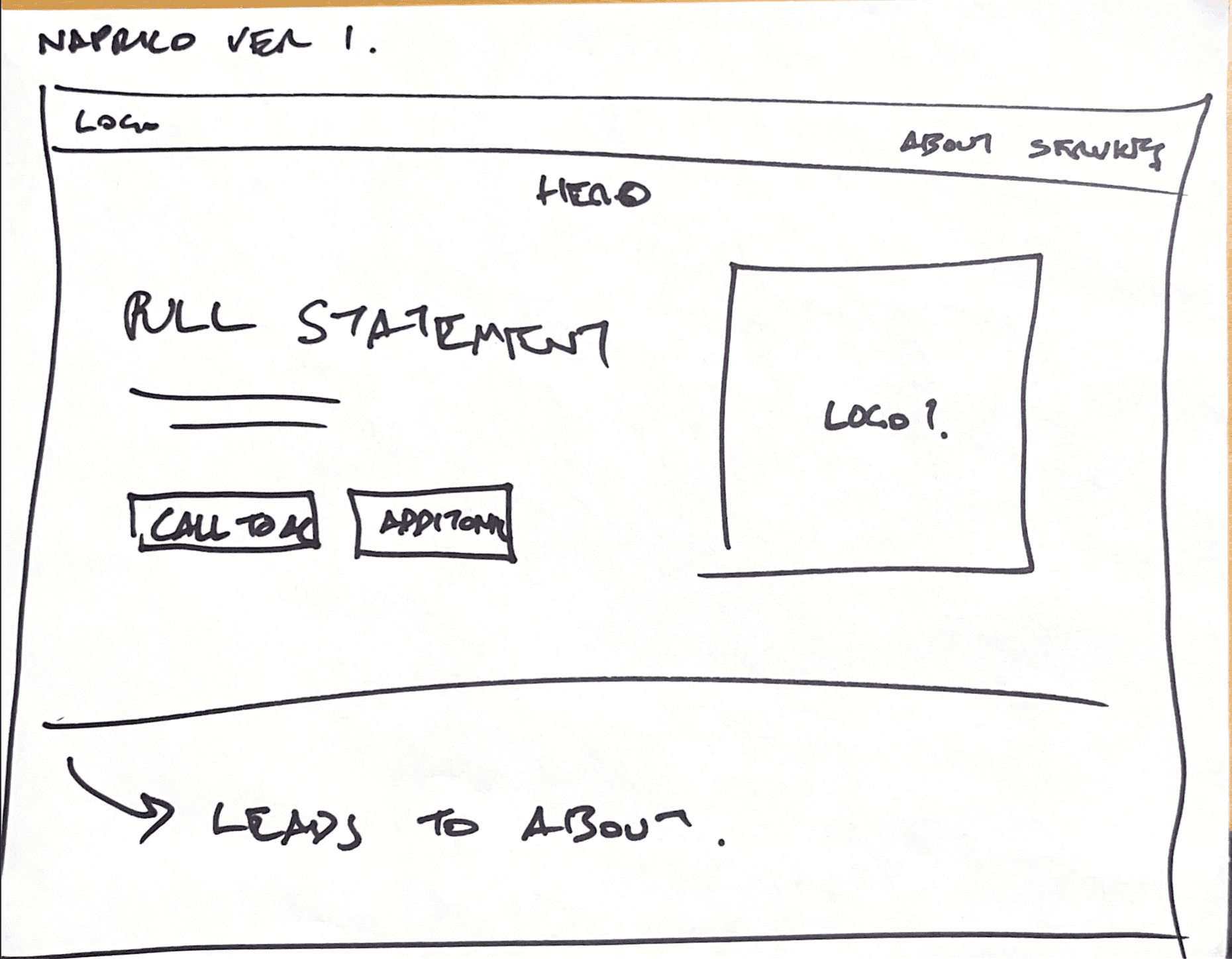
I began in Figma, refining the content with the team and setting a flow that supports conversion: hero and call to action first, then about, services, proof, and contact. Quick hand sketches confirmed flow and priorities before any polish; digital mockups then focused on clear hierarchy and calm reading.
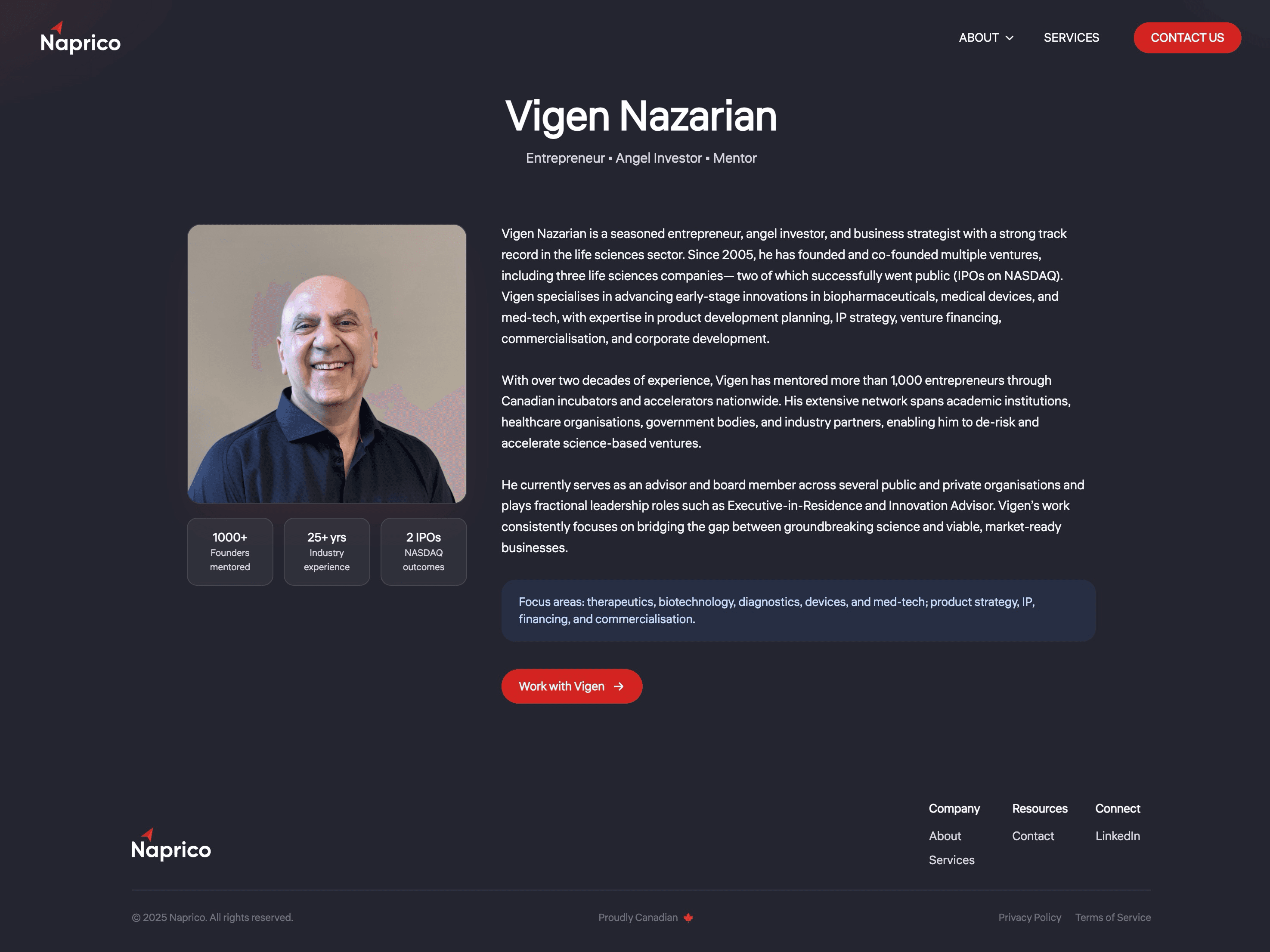
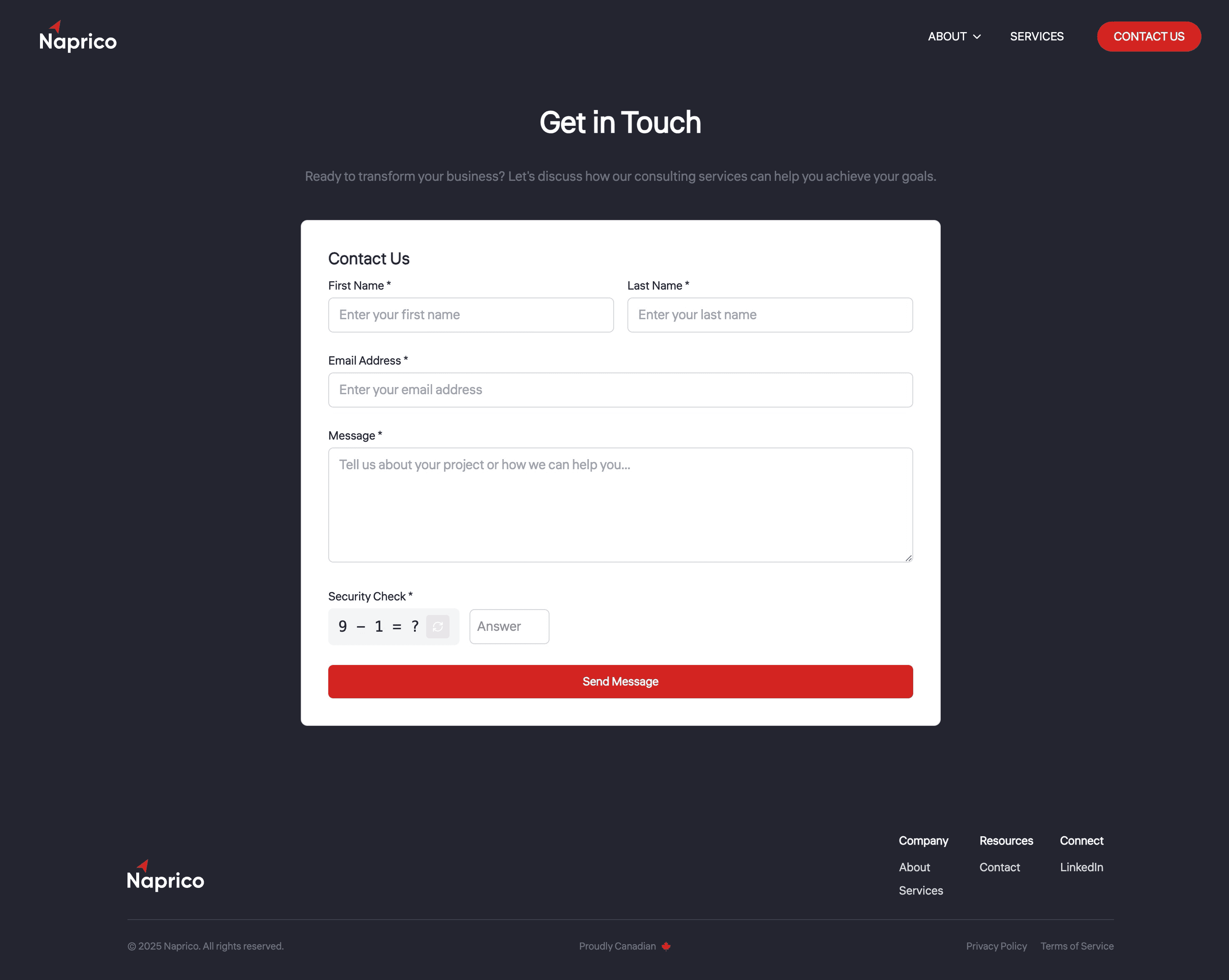
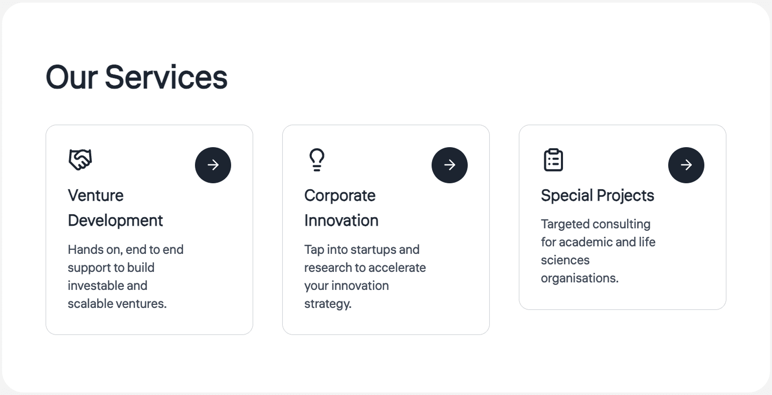
We shifted to a dark blue base with white and red accents, confident and distinct, with motion that makes the site feel alive without getting in the way. Content moves included a founder section for a personal touch, a real contact form with checks and a simple captcha, service cards that expand for detail, and a smooth client-logo carousel for social proof.

The build
Next.js for speed and crawlability, Tailwind to match the Figma layouts with little friction, and Framer Motion for light section fades, expanding cards, and the client carousel. Deployed on Vercel with analytics, a Resend-powered contact form that keeps email addresses private, Google Search Console, and a clean domain on GoDaddy.
Reflection
Instead of a static slide deck, Naprico now has a living site that introduces their brand, explains their services, highlights their clients and founder, and offers a reliable way to connect. The project reinforced the value of pairing simple structure with details: a dark palette, subtle motion, and expandable sections were small choices that made the experience feel engaging, while the build stayed light enough for the client to maintain.