Turned a UofT-backed AI startup's outdated site into a platform the client credits with real sales impact.
Full website redesign and custom-theme build for Reviewer.ly, an AI peer-review platform for journals, publishers, and research institutions.
- Designer & Frontend Developer · 2025
- Web Design
- Frontend Development
- AI Startup
- 12
- Stakeholders in weekly reviews, product through leadership
- 6
- Months from audit to shipped site, design and code
- 1
- Custom Vite-built theme replacing the block-editor site
The problem
Reviewer.ly is a University of Toronto-backed AI platform that helps journals and publishers find qualified peer reviewers for manuscripts, patents, and funding applications using deep learning. Their existing site was built on WordPress with the block editor and had not kept pace with the product: significant responsiveness issues across devices, too many pages with stale content, and a visual identity that no longer matched the credibility of the platform.
First-time visitors could not quickly understand what Reviewer.ly did or why it was worth their attention. The site was actively working against the sales process.
Auditing before designing
I started in Figma. Before designing anything I audited the existing site to understand what content was load-bearing and what could be cut. Most of the dead pages could be collapsed into a leaner structure without losing anything meaningful, and the new information architecture put the product front and centre on the landing page.
I brought initial concepts to the first of what became weekly progress reviews with the full team, around twelve people covering product, research, and leadership simultaneously. That cadence shaped the entire project. Nothing sat untested for long.
A technology constraint that became a design problem
When the Figma direction was approved and it came time to build, I proposed rebuilding the site in Next.js with React: better performance, cleaner architecture, a stack I knew well. The team pushed back, and their concern was practical and reasonable: they needed to update content themselves after handoff, and the team was comfortable with WordPress. Moving to a custom React frontend would have taken that control away entirely.
I had no prior experience building for WordPress, so the solution I arrived at was to use Vite to build a custom WordPress theme. I could write the frontend in the environment I knew, compile it as a theme, and have WordPress load and display it, and the team kept full control of their content. I used AI tooling to fill gaps in my WordPress knowledge throughout the build.
The component that earned its iterations
The most-iterated component on the project was the landing-page section walking potential clients through the full product suite. Reviewer.ly had multiple distinct offerings, and a flat list of features was not communicating the depth or differentiation of each one. Through several rounds of weekly feedback I developed an accordion where each product expands in place, with a live demo component tied to whichever product is currently selected directly underneath, visitors move from reading about a product to interacting with it in a single flow, without navigating away.
Getting the copy right took as long as getting the interaction right. The weekly reviews consistently surfaced moments where descriptions were either too technical or too vague.
The final build
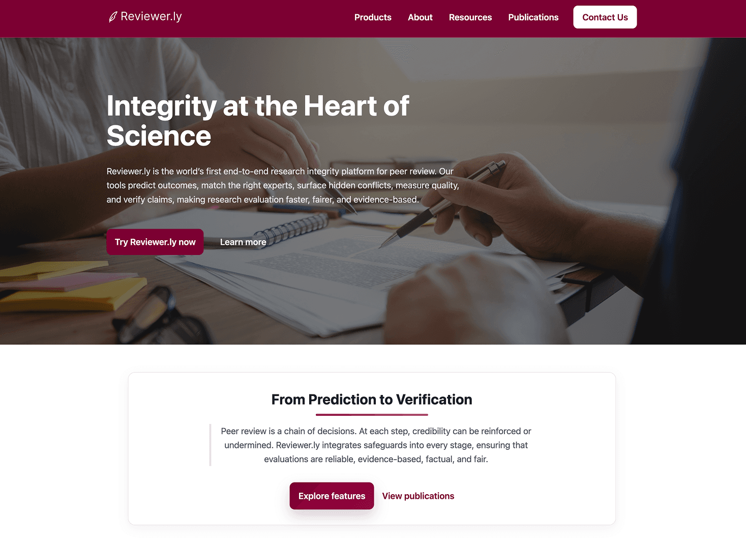
A fully custom WordPress theme built with Vite, replacing the existing block-editor site entirely. A streamlined information architecture that cut dead pages and reoriented the site around the product and its value to publishers and journals. A landing page built around the accordion and contextual demo. Responsive across devices, with a visual identity consistent with the platform's academic and institutional audience.
One constraint worth naming: restricted domain access meant no access to hosting configuration, which closed off cleaner solutions. Working within that limit was part of the job.
Outcome
Reviewer.ly went from an outdated, unresponsive site that relied on a slide deck for outreach to a live, indexed platform that communicates their full product suite and converts first-time visitors into contacts. The client confirmed the redesign made a meaningful difference to their outreach and sales conversations.
Reflection
The most useful skill on this project was not knowing how to build a WordPress theme. It was knowing how to receive feedback from a room of twelve people with different priorities and translate it into specific design decisions. The weekly review format created pressure but also momentum: nothing drifted for long, and the team felt ownership over the outcome because they had been in the room for every major decision.
Building a custom theme with Vite against a WordPress backend is not the most elegant solution, but it shipped, it works, and the team can update their content. Sometimes that is the right answer.